Goodbye Big-bloated-OTR-button
Are you using the Off-the-Record messaging plugin for Pidgin?
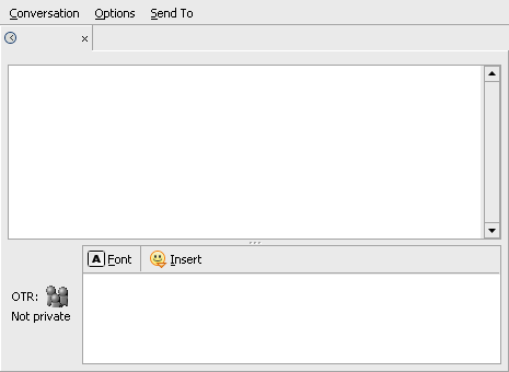
Ever get annoyed by the big bloated button?
How many times have you accidently hit that button and annoyed your friends who doesn’t use this neat plugin, which in turn starts asking you what the heck is going on?
If your answer is yes in any of these questions, then this post might be of interest to you!

Pidgin message dialog with bloated OTR button
Background:
Since I got tired of that bloated button I decided to investigate if it would be possible to resize and/or move it somewhere else, where it wouldn’t be as easy to hit by accident. And since there were no configuration for doing that, I started to look at the source code for the plugin and managed to find where in the code the button was actually rendered. (I know that you can remove the OTR button from a contact by having specific OTR settings on that specific contact. First of all, I think it would be tedious to do that for every contact you don’t use OTR with. And secondly, contacts that I DO use OTR with, I’d still have that bloated button in my face ;))
What I did:
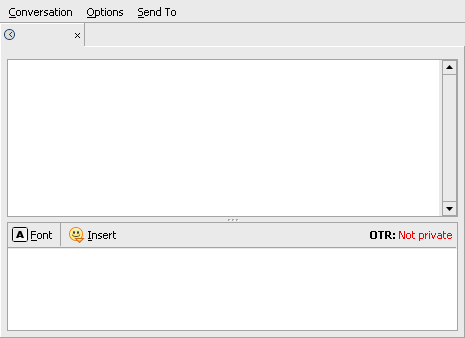
I removed the icon, since I thought it was just ugly and taking space. But instead of an icon, I color coded the different OTR status types. (Thank you for the great suggestions, wildcard :))
Finally the button was moved to the right in the formatting toolbar. Yes, I know this might not be the nicest… whatever, but I had a hard time trying to get it to be any good by doing it different. The problem was that if I wanted it to be on the right hand side of the message input area, I guess I’d also need to change some the pidgin source, because it seemed that the message input area was rendered with right alignment after the OTR button was rendered, and thus the OTR button would still end up being on the left hand side of the message input area. I’m not sure if that’s the case, but it seemed to be that way. And to start hacking on the pidgin source, would probably only complicate things even more.
Anyway, even though I don’t use formatting myself, it was a small price to pay :)
The result:

Pidgin message dialog with a bit cleaner OTR button
How you’ll do it:
Obviously, you will need the pidgin-otr source to apply this patch. And this patch is for version 3.1.0. If you have any of the previous OTR plugins installed, or version 3.1.0 installed from your package manager, it must be uninstalled first.
(Note! You will need the OTR library and toolkit (libotr) to be able to compile pidgin-otr. Further information about OTR setup at http://www.cypherpunks.ca/otr/)
- Standing in your pidgin-otr source folder, execute the following if you have OTR currently installed
$ sudo make uninstall && make clean - Download the patch into the source folder
$ wget http://blog.pesa.se/files/pidgin-otr-3.1.0.patch - Before you apply the patch, you might want to backup the original file
$ cp gtk-dialog.c gtk-dialog.c.bak - Apply the patch
$ patch -p0 < pidgin-otr-3.1.0.patch - Finally, compile and install it
$ make && sudo make install
And you’re done!
Happy private messaging in cyberspace :)
January 29th, 2008 at 06:49
OMG you are my hero. just saved me from saving to do something like this myself. thanks!
February 22nd, 2008 at 23:36
I made FC8 source and i386 rpm’s for this:
Source:
http://www.licutis.org/pidgin-otr-3.1.0-2.fc8.buttonfix.src.rpm
i386:
http://www.licutis.org/pidgin-otr-3.1.0-2.fc8.buttonfix.i386.rpm
June 14th, 2008 at 23:13
This is awesome! I can’t say how many times I’ve accidentally clicked on that huge button. It’s annoying, not to mention ugly. This looks a lot cleaner and is out of the way. Have you submitted this patch to the OTR developers? It would be nice if it were like this by default.
June 15th, 2008 at 19:22
Thank you Charles :)
Actually, they have incorporated the idea into the development version, and I think they will release it anytime soon. So hopefully, not too far from now, the “Big-bloated-OTR-button” will be a distant memory for everyone ;)